if (!require("pak")) {
  install.packages("pak")
}

needed_packages <- c(
  "ggplot2",
  "plotly",
  "ggiraph",
  "palmerpenguins", # example dataset
  "dplyr", # data handling
  "ggalluvial", # parallel plots with ggplot
  "bips-hb/ggiraphAlluvial", # parallel plots with ggiraph
  "easyalluvial", # fancy parallel plots
  "parcats" # interactive easyalluvial
)

check_and_install <- function(x) {
  if (!requireNamespace(x, quietly = TRUE)) {
    pak::pkg_install(x)
  }
}

invisible(lapply(needed_packages, check_and_install))Introduction
Interactive graphs are getting popular and easy to make in R.
But when does your plot benefits from being interactive?
Only consider interactive graphs if the output can be an html page. With interactive graphs, you will not be able to print the document easily nor receive comments inside the document you shared.
Here is a quick comparison of the respective advantages of static vs interactive graphs.
| Static | Interactive |
|---|---|
| printed document | identifying outliers |
| getting feedback on draft | large and complex graphs * |
| publication | exploration |
N.B. Complex graphs (e.g. with many overlapping lines) will be more readable with interactive graphs for the data exploration stage. Yet, for finalized results, well-designed simple graphs are always more impactful.
Interactive maps are especially popular because users like to zoom on specific locations. However, this topic will not be covered in this post. If interested, have a look at the R-packages leaflet, mapview or tmaps.
Packages
In the following blog post, we will show in parallel three ways to produce interactive graphs:
- ggplot + plotly
- native plotly
- ggiraph
plotly is a general javascript-based graphing library, which has extensions in for several programming languages. In R, there are two main ways to interact with plotly: via ggplot or via its R native syntax.
ggiraph is an extension of ggplot implementing additional geom_ functions which make the corresponding plot element interactive (e.g. geom_point in base ggplot -> geom_point_interactive in ggiraph). Interactive geometries comes with a tooltip aesthetic, which allows to control the information displayed when the element is hovered.
A comparison between plotly and ggiraph is also available in the ggiraph book.
Dataset
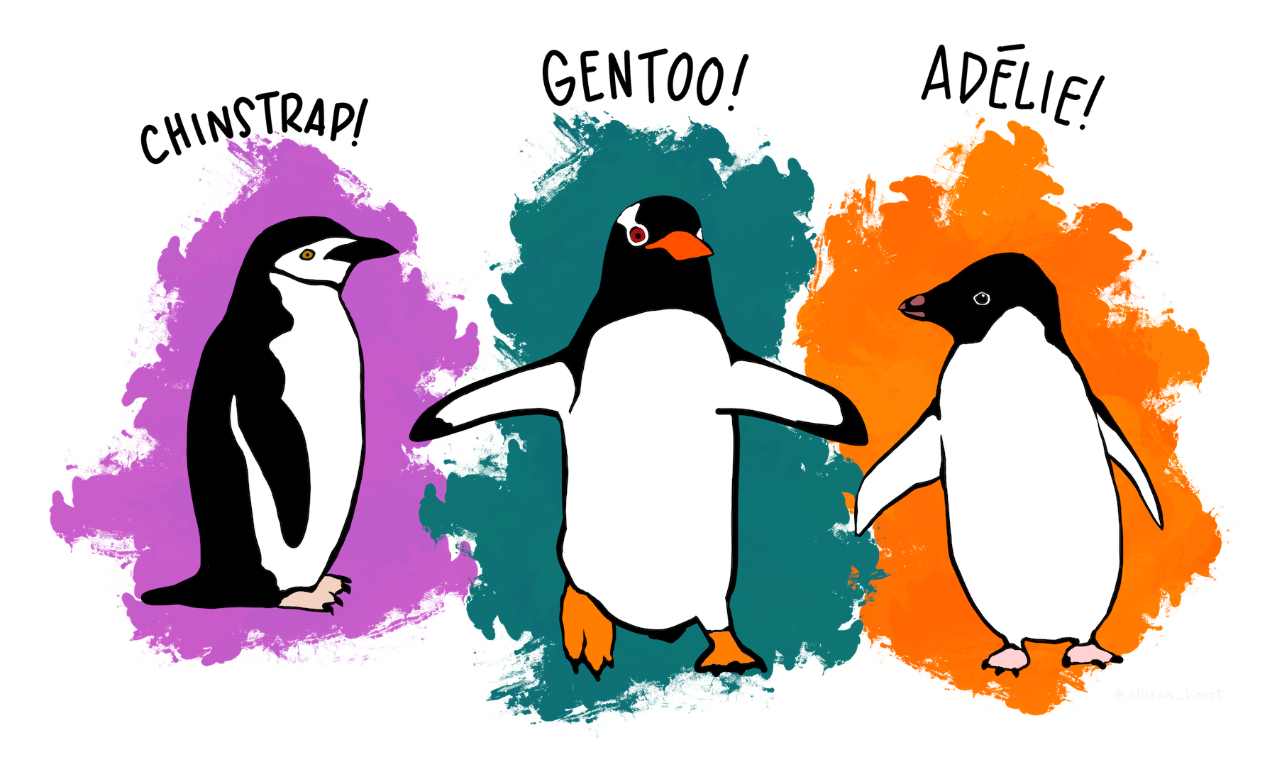
To illustrate to interactive graphs capabilities, we will use the palmerpenguins package. It contains the penguins dataset with size measurements for three penguin species observed on three islands in the Palmer Archipelago, Antarctica.
These data were collected from 2007 and 2009 by Dr. Kristen Gorman and are released under the CC0 license.
Set-up
Install the needed packages
Load the packages and dataset
Explore Palmer’s penguins dataset
# A tibble: 6 × 8
  species island    bill_length_mm bill_depth_mm flipper_length_mm body_mass_g
  <fct>   <fct>              <dbl>         <dbl>             <int>       <int>
1 Adelie  Torgersen           39.1          18.7               181        3750
2 Adelie  Torgersen           39.5          17.4               186        3800
3 Adelie  Torgersen           40.3          18                 195        3250
4 Adelie  Torgersen           NA            NA                  NA          NA
5 Adelie  Torgersen           36.7          19.3               193        3450
6 Adelie  Torgersen           39.3          20.6               190        3650
# ℹ 2 more variables: sex <fct>, year <int>[1] 344 8Scatter plot
Simple scatter plot
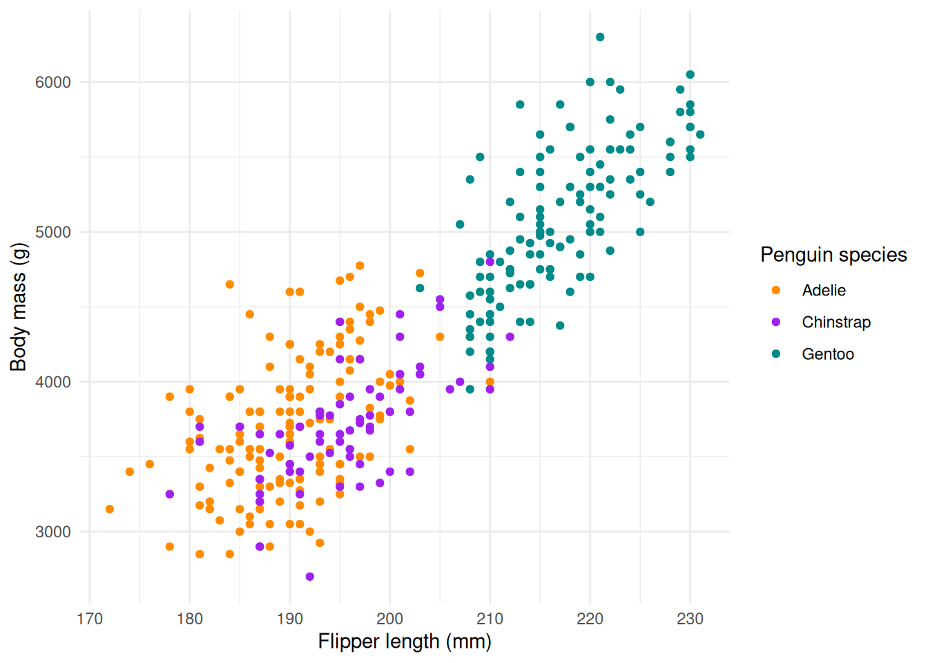
Let’s visualize the body mass in function of the flipper length, colored by species.
g1 <- ggplot(
  data = penguins,
  aes(x = flipper_length_mm, y = body_mass_g)
) +
  geom_point(aes(color = species)) +
  scale_color_manual(values = c("darkorange", "purple", "cyan4")) +
  labs(
    x = "Flipper length (mm)",
    y = "Body mass (g)",
    color = "Penguin species"
  )

p1_gg <- ggplotly(g1)
style(p1_gg, hoverinfo = "text", text = penguins$ID)
p1_py <- plot_ly(penguins) |>
add_markers(
x = ~flipper_length_mm,
y = ~body_mass_g,
color = ~species,
colors = c("darkorange", "purple", "cyan4"),
text = ~ID,
hoverinfo = "text"
) |>
layout(
xaxis = list(title = "Flipper length (mm)"),
yaxis = list(title = "Body mass (g)"),
legend = list(title = list(text = "Penguin species"))
)
p1_pyg1_gi <- ggplot(
data = penguins,
aes(x = flipper_length_mm, y = body_mass_g)
) +
geom_point_interactive(
aes(
color = species,
tooltip = ID,
# data_id = year
)
) +
scale_color_manual(values = c("darkorange", "purple", "cyan4")) +
labs(
x = "Flipper length (mm)",
y = "Body mass (g)",
color = "Penguin species"
)
girafe(
ggobj = g1_gi,
options = list(
opts_zoom(max = 5)
)
)
Regression
g2 <- ggplot(
  data = penguins,
  aes(x = flipper_length_mm, y = body_mass_g)
) +
  geom_point(aes(color = species), alpha = 0.8) +
  geom_smooth(method = "lm", se = TRUE) +
  scale_color_manual(values = c("darkorange", "purple", "cyan4")) +
  labs(
    x = "Flipper length (mm)",
    y = "Body mass (g)",
    color = "Penguin species"
  )

p2_gg <- ggplotly(g2)
p2_gg
It is slightly more complicated to show regression with native plotly functions. First you need to calculate the linear regression and its prediction.
# calculate linear regression
lm1 <- lm(body_mass_g ~ flipper_length_mm, data = penguins)
# make a sequence of 1000 values along x range
xrange <- range(penguins$flipper_length_mm, na.rm = TRUE)
xseq <- seq(xrange[1], xrange[2], length.out = 1000)
# predicts values on xseq
predlm1 <- predict(lm1, data.frame(flipper_length_mm = xseq), se = TRUE)

# make the interactive graph
plot_ly(penguins) |>
  add_markers(
    x = ~flipper_length_mm,
    y = ~body_mass_g,
    color = ~species,
    colors = c("darkorange", "purple", "cyan4"),
    text = ~ID,
    hoverinfo = "text"
  ) |>
  add_ribbons(
    x = xseq,
    ymin = predlm1$fit - 1.96 * predlm1$se.fit,
    ymax = predlm1$fit + 1.96 * predlm1$se.fit,
    color = I("gray80"),
    showlegend = FALSE
  ) |>
  add_lines(
    x = xseq,
    y = predlm1$fit,
    color = I("steelblue"),
    showlegend = FALSE
  ) |>
  layout(
    xaxis = list(title = "Flipper length (mm)"),
    yaxis = list(title = "Body mass (g)"),
    legend = list(title = list(text = "Penguin species"))
  )
In ggiraph, there is no native way to display information about different points of a line: only one element can be shown for the whole line (for instance, the model equation).
# Precompute the model and save formula / R2
model <- lm(body_mass_g ~ flipper_length_mm, data = penguins)
coefs <- coef(model)
formula_label <- paste0(
  "y = ",
  round(coefs[2], 2),
  "x +",
  round(coefs[1], 2),
  "\n",
  "R² = ",
  round(summary(model)$r.squared, 2)
)

g2_gi <- ggplot(
  data = penguins,
  aes(x = flipper_length_mm, y = body_mass_g)
) +
  geom_point_interactive(
    aes(
      color = species,
      tooltip = paste(
        "Flipper length (mm): ",
        flipper_length_mm,
        "\n",
        "Body mass (g): ",
        body_mass_g,
        "\n",
        "Species:",
        species
      )
    ),
    alpha = 0.8
  ) +
  geom_smooth_interactive(
    method = "lm",
    se = TRUE,
    aes(tooltip = formula_label)
  ) +
  scale_color_manual(values = c("darkorange", "purple", "cyan4")) +
  labs(
    x = "Flipper length (mm)",
    y = "Body mass (g)",
    color = "Penguin species"
  )

girafe(g2_gi)
`geom_smooth()` using formula = 'y ~ x'Boxplot
Simple boxplot
The information we want to display on the boxplots is not present in the original data: to choose the tooltip, we use after_stat which lets us access these values. The available values can be inspected by calling layer_data on our graph.
g3_gi <- ggplot(
  penguins,
  aes(x = species, y = flipper_length_mm, color = species)
) +
  geom_boxplot_interactive(
    width = 0.3,
    show.legend = FALSE,
    aes(
      tooltip = after_stat({
        paste0(
          "species: ",
          .data$color,
          "\nq1: ",
          .data$lower,
          "\nmedian: ",
          .data$middle,
          "\nq3: ",
          .data$upper
        )
      })
    )
  ) +
  scale_color_manual(values = c("darkorange", "purple", "cyan4")) +
  labs(x = "Species", y = "Flipper length (mm)")

# To see the column names we can use in after_stat, we can inspect layer_data():
# layer_data(g3_gi)
girafe(g3_gi)
Boxplot per group
g4_gi <- ggplot(
  penguins |> filter(!is.na(sex)),
  aes(x = species, y = flipper_length_mm, fill = sex)
) +
  geom_boxplot_interactive(
    aes(
      tooltip = after_stat({
        paste0(
          "sex: ",
          .data$fill,
          "\nq1: ",
          .data$lower,
          "\nmedian: ",
          .data$middle,
          "\nq3: ",
          .data$upper
        )
      })
    )
  ) +
  scale_fill_manual(values = c("darkorange", "cyan4")) +
  labs(x = "Species", y = "Flipper length (mm)", fill = "Sex")

girafe(g4_gi)
Histogram and bars
Histogram
N.B.: it is important to force bin size identical across species, else representation might be misleading, unless histnorm = “density”.
g5_gi <- ggplot(data = penguins, aes(x = flipper_length_mm, fill = species)) +
  geom_histogram_interactive(
    alpha = 0.5,
    position = "identity",
    binwidth = 2,
    aes(
      tooltip = after_stat({
        paste0(
          "species: ",
          .data$fill,
          "\ncount: ",
          .data$count,
          "\nFlipper length: ",
          .data$xmin,
          "-",
          .data$xmax
        )
      })
    )
  ) +
  scale_fill_manual(values = c("darkorange", "purple", "cyan4")) +
  labs(x = "flipper length (mm)", y = "Frequency")

girafe(g5_gi)
Barplot
geom_bar: na.rm = FALSE, just = 0.5, lineend = butt, linejoin = mitre
stat_count: na.rm = FALSE
position_dodge year_species <- table(penguins$species, penguins$year) |> as.data.frame()
names(year_species) <- c("species", "year", "count")
p7_py <- plot_ly(
year_species,
x = ~year,
y = ~count,
color = ~species,
colors = c("darkorange", "purple", "cyan4"),
type = 'bar'
) |>
layout(
barmode = "stack",
xaxis = list(title = "Year"),
yaxis = list(title = "Count"),
legend = list(title = list(text = "Species")),
hovermode = "x unified"
)
p7_pyg6_gi <- ggplot(
data = penguins,
aes(x = year, fill = species)
) +
geom_bar_interactive(aes(
tooltip = after_stat({
paste0(
"species: ",
.data$fill,
"\ncount: ",
.data$count,
"\nyear: ",
.data$x
)
})
)) +
scale_fill_manual(values = c("darkorange", "purple", "cyan4")) +
labs(
x = "Year",
y = "Count",
fill = "Species"
)
girafe(g6_gi)To go further
- palmerpenguins R package - link
- plotly documentation and book
- ggiraph documentation and book
- ggplot documentation and its integration with plotly
Other tips and tricks
Export as html
To share easily the interactive graphs in an html file, it might be easier to create self-contained HTML (even if the file size will be large, there will be only one single file).
In a quarto document, make sure to have in the header:
To save a single plot in an self-contained html file, you can use:
Render large dataset
If you have many data points, use WebGL which is a lot more efficient at rendering heavy dataset.
Remove the long list of icons
By default, ggiraph displays only the saving and fullscreen icons (version 0.9.6). They can be removed as showed below (see opts_toolbar documentation):
More generally, the girafe function lets you customize interactive elements. See the ggiraph documentation for more information.
Other fancy graphs
Facet
For facet plot, it is easier to use the native ggplot functions.
g8 <- ggplot(
  data = penguins,
  aes(x = flipper_length_mm, y = body_mass_g)
) +
  geom_point(aes(color = sex)) +
  scale_color_manual(values = c("darkorange", "cyan4"), na.translate = FALSE) +
  labs(
    x = "Flipper length (mm)",
    y = "Body mass (g)",
    color = "Penguin sex"
  ) +
  facet_wrap(~species)

p8_gg <- ggplotly(g8)
p8_gg
The function to arrange multiple plots in plotly is plotly::subplot(). It is very flexible and can accomodate all type of graphs. But in our case, the sub plots per species have to be created one by one. We use the function split and lapply to automate the plot creation.
penguins_per_species <- split(penguins, ~species)
p8_py <- lapply(penguins_per_species, function(df) {
  plot_ly(df) |>
    add_markers(
      x = ~flipper_length_mm,
      y = ~body_mass_g,
      color = ~sex,
      colors = c("darkorange", "cyan4"),
      legendgroup = ~sex,
      showlegend = df$species[1] == names(penguins_per_species)[1]
    ) |>
    layout(
      xaxis = list(
        tickangle = -45,
        title = ifelse(
          df$species[1] == names(penguins_per_species)[2],
          "Flipper length (mm)",
          ""
        )
      )
    )
})

subplot(
  p8_py,
  nrows = 1,
  shareX = TRUE,
  shareY = TRUE,
  titleX = TRUE,
  titleY = TRUE
) |>
  layout(
    legend = list(title = list(text = "Penguin sex"))
  )
g8_gi <- ggplot(
data = penguins,
aes(x = flipper_length_mm, y = body_mass_g)
) +
geom_point_interactive(
aes(
color = sex,
tooltip = paste0(
"species: ",
species,
"\nsex: ",
sex,
"\nbody mass: ",
body_mass_g,
"\nflipper length: ",
flipper_length_mm
)
)
) +
scale_color_manual(values = c("darkorange", "cyan4"), na.translate = FALSE) +
labs(
x = "Flipper length (mm)",
y = "Body mass (g)",
color = "Penguin sex"
) +
facet_wrap(~species)
girafe(g8_gi)Multiple regressions
To draw multiple regression, it is much simpler to use the native ggplot functions.
g9 <- ggplot(
  data = penguins,
  aes(x = bill_length_mm, y = bill_depth_mm)
) +
  geom_point(aes(color = species), alpha = 0.8) +
  geom_smooth(method = "lm", se = FALSE, aes(color = species)) +
  scale_color_manual(values = c("darkorange", "purple", "cyan4")) +
  labs(
    x = "Bill length (mm)",
    y = "Bill depth (mm)",
    color = "Penguin species",
  )

p9_gg <- ggplotly(g9)
`geom_smooth()` using formula = 'y ~ x'g9_gi <- ggplot(
data = penguins,
aes(x = bill_length_mm, y = bill_depth_mm)
) +
geom_point_interactive(
aes(
color = species,
tooltip = paste0(
"bill length: ",
bill_length_mm,
"\nbill depth: ",
bill_depth_mm,
"\nspecies: ",
species
)
),
alpha = 0.8
) +
geom_smooth_interactive(
method = "lm",
se = FALSE,
aes(
color = species,
tooltip = paste0("species: ", species)
)
) +
scale_color_manual(values = c("darkorange", "purple", "cyan4")) +
labs(
x = "Bill length (mm)",
y = "Bill depth (mm)",
color = "Penguin species",
)
girafe(g9_gi)`geom_smooth()` using formula = 'y ~ x'Violin plot
Violin plot are integrated natively in plotly.
p10_py <- plot_ly(
  penguins,
  x = ~species,
  y = ~flipper_length_mm,
  color = ~sex,
  colors = c("darkorange", "cyan4"),
  type = "violin",
  box = list(visible = T)
) |>
  layout(
    xaxis = list(title = "Species"),
    yaxis = list(title = "Flipper length (mm)"),
    legend = list(title = list(text = 'Sex')),
    violinmode = "group"
  )

p10_py
g10_gi <- ggplot(
penguins,
aes(x = species, y = flipper_length_mm, fill = sex, color = sex)
) +
geom_violin_interactive(
alpha = 0.2,
position = position_dodge(width = 0.9), # same for violin and boxplot
aes(
tooltip = paste0(
"species: ",
species,
"\nsex :",
sex
)
)
) +
geom_boxplot_interactive(
alpha = 0.2,
width = 0.3, # make boxplot thinner than violin
position = position_dodge(width = 0.9), # same for violin and boxplot
aes(
tooltip = after_stat({
paste0(
"sex: ",
.data$fill,
"\nq1: ",
.data$lower,
"\nmedian: ",
.data$middle,
"\nq3: ",
.data$upper
)
})
)
) +
scale_fill_manual(values = c("darkorange", "cyan4")) +
scale_colour_manual(values = c("darkorange", "cyan4"))
girafe(g10_gi)Parallel plot
In this case, plotly is much easier. But check out ggalluvial, easyalluvial, and parcats. The package parcats offers the best looking interactive parallel plots.
# Create dimensions (one per categorical variable)
dims <- list(
  list(label = "Species", values = penguins$species),
  list(label = "Island", values = penguins$island),
  list(label = "Sex", values = penguins$sex),
  list(label = "Year", values = penguins$year)
)

p10_py <- plot_ly(
  type = "parcats",
  dimensions = dims,
  line = list(
    color = as.integer(penguins$species),
    colorscale = list(
      list(0, "#1f77b4"),
      list(0.5, "#ff7f0e"),
      list(1, "#2ca02c")
    )
  ),
  arrangement = "freeform",
  hoveron = "category"
)
p10_py
The interactive geometries corresponding to ggalluvial don’t exist in ggiraph yet: we use the ggiraphAlluvial package:
Important
There is an error in the legend caused by ggiraphAlluvial (colors aren’t displayed).
# First transform the data
penguins_alluvial <- penguins
penguins_alluvial$year <- factor(penguins_alluvial$year)
penguins_alluvial <- penguins_alluvial |>
  dplyr::count(island, sex, year, species)

g10_gi <- ggplot(
  data = penguins_alluvial,
  aes(
    axis1 = species,
    axis2 = island,
    axis3 = sex,
    axis4 = year,
    y = n
  )
) +
  ggiraphAlluvial::geom_flow_interactive(
    aes(
      fill = species,
      tooltip = after_stat({
        paste0(
          "from: ",
          .data$stratum,
          "\ncount: ",
          .data$count
        )
      }),
    ),
    aes.bind = "flows"
  ) +
  ggiraphAlluvial::geom_stratum_interactive(
    aes(tooltip = after_stat(stratum))
  ) +
  geom_text(
    stat = "stratum",
    aes(label = after_stat(stratum))
  ) +
  scale_fill_manual(
    values = c(
      "Adelie" = "#1f77b4",
      "Chinstrap" = "#2ca02c",
      "Gentoo" = "#ff7f0e"
    )
  )

girafe(g10_gi)
# Create dimensions (one per categorical variable)
# select the column to be plotted
df <- penguins[, c("species", "island", "sex", "year")]
# transform numeric year into text
df$year <- as.character(df$year)
# create the static plot with easyalluvial
p <- easyalluvial::alluvial_wide(
df,
col_vector_flow = c("#1f77b4", "#ff7f0e", "#2ca02c"),
)
# render as interactive graph
parcats::parcats(
p,
marginal_histograms = FALSE,
hoveron = 'category',
hoverinfo = 'count',
data_input = df,
)