funbiogeo contains many plotting functions. They have
multiple goals: (1) propose good default plots to inspect and represent
your data, (2) provide easy plotting methods for complex objects
(automatically display maps from spatial objects), and (3) provide
plotting methods for computed functional diversity metrics in other
packages. This vignette explains in detail all plotting functions
available in funbiogeo, how to use them and how to
interpret them.
Some of these plotting functions use different data inputs and some of them can deal with species categorization, i.e., displaying information by each category of species (family, order, endemism status, etc.). We detail the standard needed inputs in the table below. The “Additional input” column represents needed input that is not the other standard tables specified by the other columns.
| Function name | Site x species |
Species x traits |
Site x locations |
Species category | Additional input |
|---|---|---|---|---|---|
fb_plot_distribution_site_trait_coverage() |
✳️ | ✳️ | ➖ | 🟠 | ➖ |
fb_plot_number_sites_by_species() |
✳️ | ➖ | ➖ | ➖ | ➖ |
fb_plot_number_species_by_trait() |
➖ | ✳️ | ➖ | 🟠 | ➖ |
fb_plot_number_traits_by_species() |
➖ | ✳️ | ➖ | 🟠 | ➖ |
fb_plot_site_environment() |
➖ | ➖ | ✳️ | ➖ | ✳️ |
fb_plot_site_traits_completeness() |
✳️ | ✳️ | ➖ | 🟠️ | ➖ |
fb_plot_species_traits_completeness() |
➖ | ✳️ | ➖ | 🟠 | ➖ |
fb_plot_species_traits_missingness() |
➖ | ✳️ | ➖ | 🟠 | ➖ |
fb_plot_trait_combination_frequencies() |
➖ | ✳️ | ➖ | 🟠 | ➖ |
fb_plot_trait_correlation() |
➖ | ✳️ | ➖ | 🟠 | ➖ |
fb_map_raster() |
➖ | ➖ | ➖ | ➖ | ✳️ |
fb_map_site_data() |
➖ | ➖ | ✳️ | ➖ | ✳️ |
fb_map_site_traits_completeness() |
✳️ | ✳️ | ✳️ | ➖ | ➖ |
Let’s first load the package and example datasets included in the
funbiogeo.
library("funbiogeo")
library("sf")
#> Linking to GEOS 3.12.1, GDAL 3.8.4, PROJ 9.4.0; sf_use_s2() is TRUE

data("woodiv_locations")
data("woodiv_site_species")
data("woodiv_traits")
Naming Convention
Like in the rest of the funbiogeo package, the functions
are named following certain conventions. For one, to avoid any collision
with other packages, all the functions are prefixed with
fb_. Second all plotting functions begin with either
fb_plot_*(), when they are regular plots, or
fb_map_*() when they plot maps.
The function names in funbiogeo are generally long to be
as specific and clear as possible. So in case of doubt, reread the
function name, and what it should represent should be clear from the
name.
Regular Plots
In this section we will describe what we call “regular plots,” i.e.,
plots of non-spatial objects (density plots, bivariate plots, lollipop
charts, heatmaps, etc.). We made this distinction because maps have
their own specific challenges. All the default regular plots included in
funbiogeo are quite specific to the data. In each of the
sections below, we’ll summarize what the plot is about, what are the
needed arguments, and how to interpret the output.
The functions are all described in their specific subsections in alphabetical order.
Distribution of Trait Coverage Across Sites
Visualizing the trait coverage of all sites can help isolate which traits may show consistently low coverage. Also this can help notice if some groups of sites have higher coverage for certain traits than for others.
You can plot this using the
fb_plot_distribution_site_trait_coverage() function. It
takes two arguments: site_species the site by species
data.frame and species_traits the species by
traits data.frame. The function leverages stacked density
plots of trait coverage across sites (nicknamed ‘ridges’). They
represent the distribution of trait coverage across all sites for each
trait separately.
Note: the function internally uses the ggridges
package to plot the distributions. This package is thus needed to run
this function. Use install.packages("ggridges") to install
this package.
Example:
fb_plot_distribution_site_trait_coverage(woodiv_site_species, woodiv_traits)
#> Loading required namespace: ggridges
#> Picking joint bandwidth of 0.0445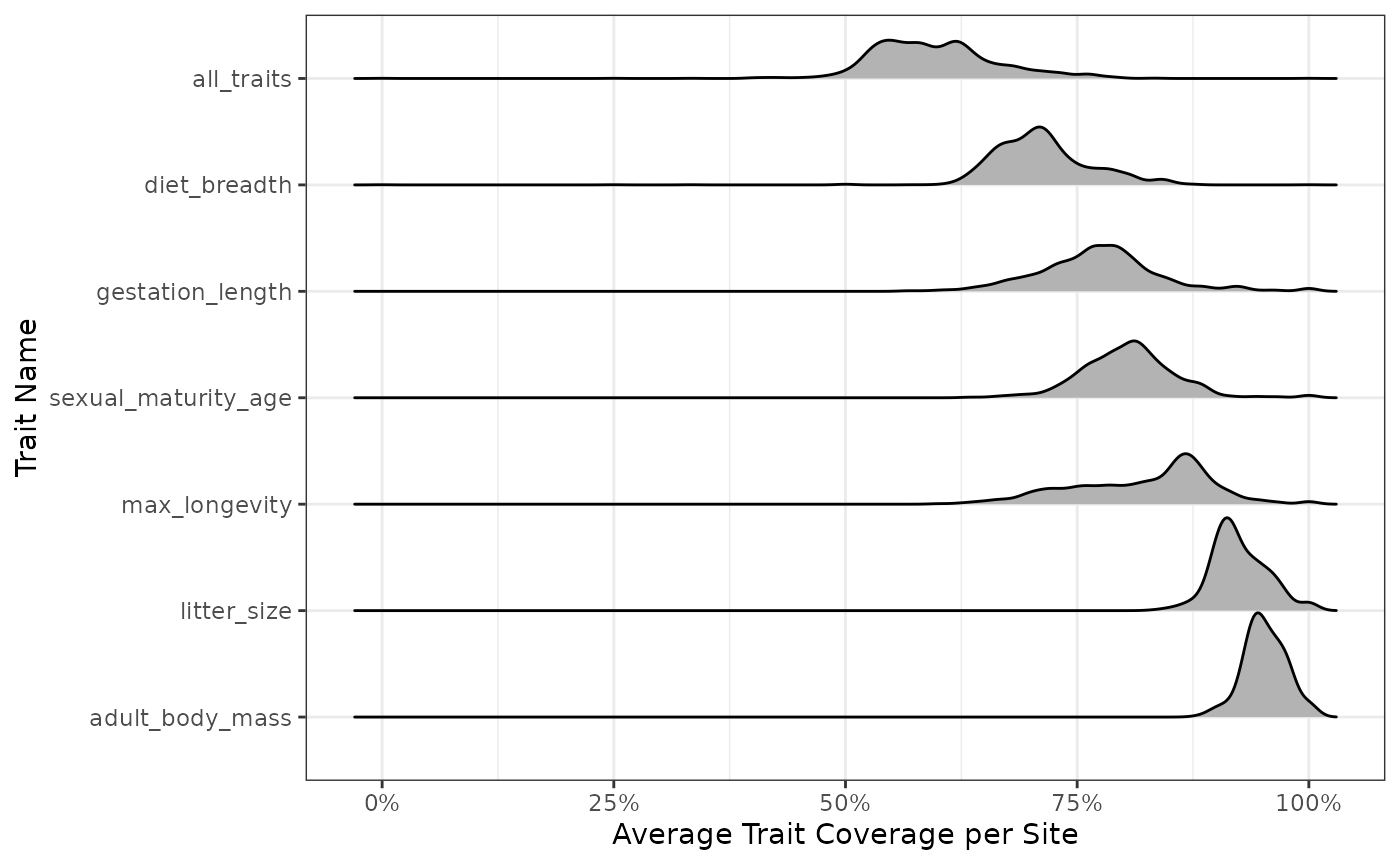
We see the distribution of species coverage per site (along the
x-axis) for each trait (along the y-axis) and with all traits taken
together (shown at the top of the top of the line
all_traits). The proportions on the y-axis labels are the
average coverage observed for this trait. We see that we have very
similar average coverage for all sites (average number of species for
which we have not NA trait data), whatever the trait we consider, which
is about 100% of species.
This plot considers the distribution of species across sites instead
of focusing only on the species by traits data.frame. This
may be useful to realize, for example, that the traits of a species
occurring are very rarely missing. This wouldn’t necessarily translate
into low site-level trait coverage.
Plotting the Number of Sites by Species
The function fb_plot_number_sites_by_species() allows to
explore the site by species data.frame. It shows the number
(and proportion) of sites occupied by each species. Its first argument
is site_species, the site by species
data.frame is necessary, while the second one
threshold_sites_proportion, a target proportion of site
coverage, is optional.
fb_plot_number_sites_by_species(woodiv_site_species)
The function outputs a dotchart. The number of occupied sites per species is indicated at the bottom x-axis, while the top x-axis represents the proportion of occupied sites. The left y-axis labels species names (in parentheses) and their rank by increasing prevalence. Note that, for readability constraints, only a limited number of species are labeled on the y-axis, but they are all displayed as dots on the plot.
Adding the second argument threshold_sites_proportion
displays a vertical bar at the target proportion of sites to see how
many species occupy more or less than the given proportion of sites.
Let’s say we want to see the species present in at least 40% of the sites:
fb_plot_number_sites_by_species(
  woodiv_site_species,
  threshold_sites_proportion = 0.4
)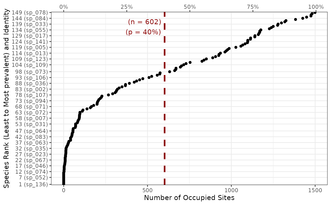
The threshold bar helps us get a sense of how many species are present in at least 40% of the sites. It also displays the corresponding number of sites.
Plotting the Number of Species per Trait
One way to look at the species by traits data.frame is
to look at number of species with non-missing trait values for each
trait. The fb_plot_number_species_by_trait() function does
exactly that. Its first argument species_traits, the
species by traits data.frame, is necessary, while the
second one threshold_species_proportion, a target
proportion of species coverage, is optional.
fb_plot_number_species_by_trait(woodiv_traits)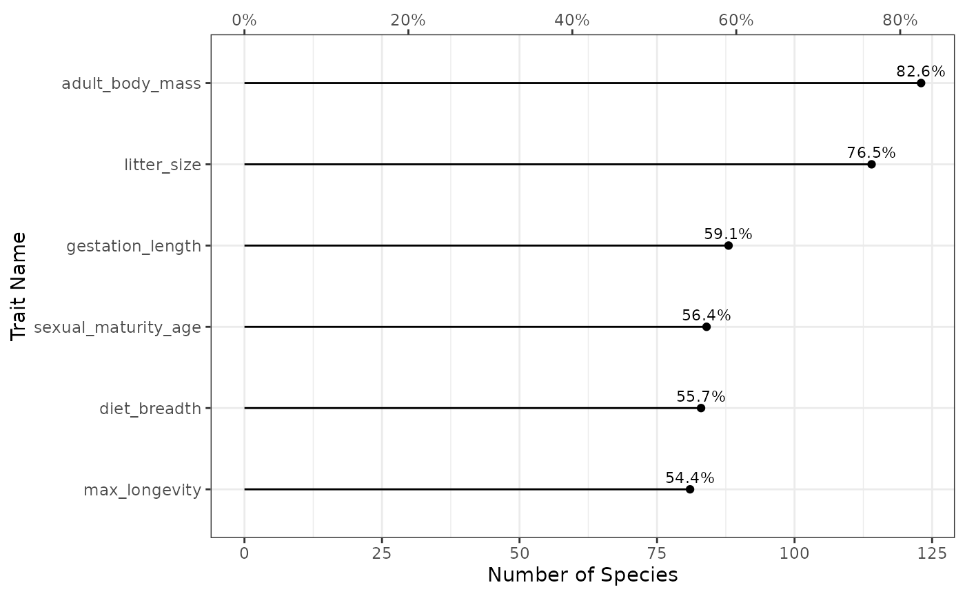
The function outputs a lollipop chart. On the bottom x-axis, there is
the number of species covered by the given trait (the top x-axis
represents the proportion of species, which is directly proportional).
The y-axis represents each trait. The dot represents the actual coverage
observed with the corresponding proportion of species written on top.
With this figure we see that 70.8% of the species have a non-missing SLA
in the species by trait data.frame, while 100% have a
non-missing plant height.
Adding the second argument threshold_species_proportion
displays a vertical bar at the target proportion to easily target traits
covering a certain proportion of species. Let’s say we want to see
traits available for at least 90% of the species:
fb_plot_number_species_by_trait(
  woodiv_traits,
  threshold_species_proportion = 0.9
)
The red dashed vertical line shows the corresponding species coverage with labels indicating the proportion and corresponding number of species (n = 22).
Plotting the Number of Traits per Species
You can also display the number of traits available per species. Showing it for each species would be quite difficult to read, so we decided instead to represent the number of species having given the number of known traits. Also, because most trait ecologists are interested in multiple traits, we considered nested proportions of traits: considering the number of species covered by at least one trait, at least two, etc.
To represent such a plot, you can use the function
fb_plot_number_traits_by_species(), it uses two arguments.
The first species_traits is the species by traits
data.frame. The second argument is
threshold_species_proportion which is optional and
corresponds to a certain threshold proportion of species so that a line
can be added to the plot.
Using it on the included dataset gives:
fb_plot_number_traits_by_species(woodiv_traits)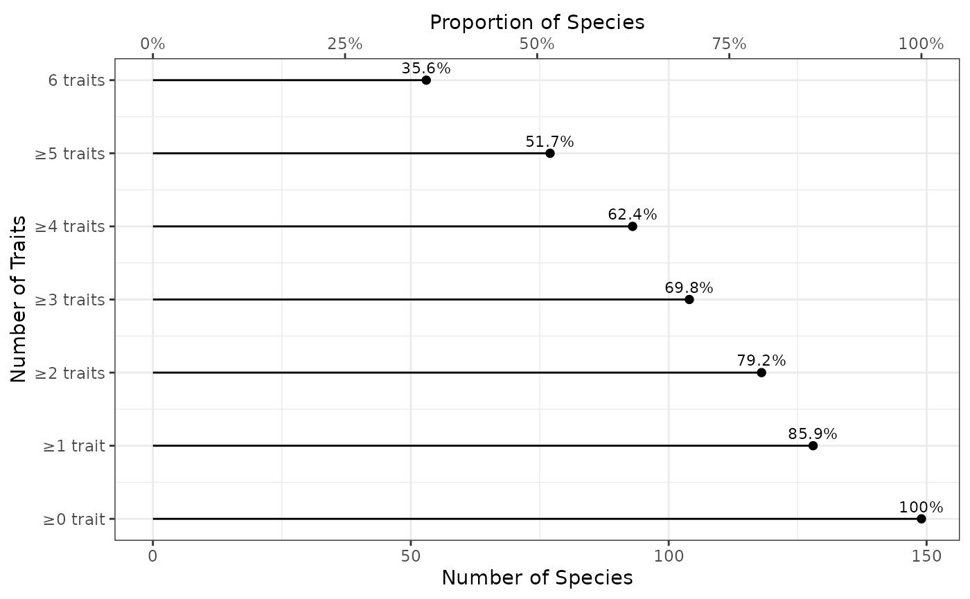
The x-axis represents the number of species concerned (bottom x-axis displays the actual number of species, while top x-axis displays the corresponding proportion of species). The y-axis shows the number of each traits. Note that the categories are nested: the set of species with at least 1 trait contains the set of species with at least 2 traits, and so on and so forth. By definition all species have 0 or better known traits, but we show that in the plot as a reference to see how the proportion decreases with the increasing number of traits. The proportion is shown as text above each dot representing it. So, for example, there are 79.2% of species with at least 3 non-missing traits.
This plot does not tell us if all species with at least 3 traits share the same trait combination (there are multiple 3 trait combinations), but it’s a first indication.
Let’s say we’re interested in combinations of traits with at least 50% of species covered. We can use the second argument to show it:
fb_plot_number_traits_by_species(
  woodiv_traits,
  threshold_species_proportion = 0.5
)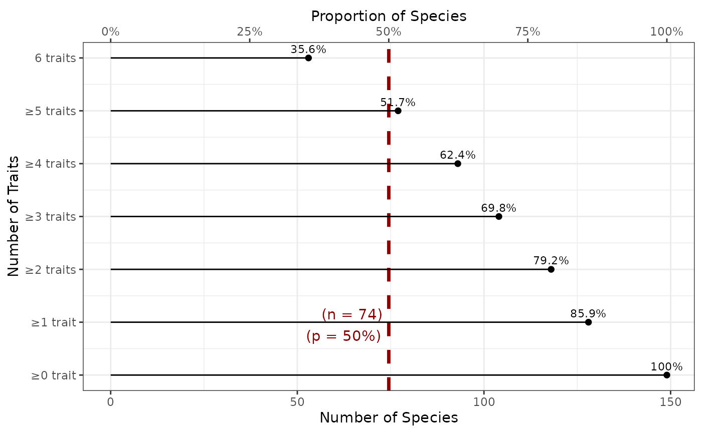
Adding this argument displays a vertical bar at the target proportion of species to easily target the number of traits covering a certain proportion of species. The red dashed vertical line shows the corresponding species coverage with labels indicating the proportion and corresponding number of species (n = 12)
Plotting Environmental Position of Sites
To see if our sites are biased environmentally, it can be nice to
locate them along with environmental variables compared to a full
region. For the sake of simplicity, we can focus on two variables
against which to compare our sites to a region. That is what the
fb_plot_site_environment() function does. It has four
arguments: the first one, site_locations, provides the
locations of sites as a sf object,
environment_raster is a terra
raster object. The next two arguments are first_layer and
second_layer which are the names of the two variables to be
extracted from environment_raster to make our plot.
From the included dataset, we can represent the first 6 sites along total annual precipitation and mean annual temperature over the full region:
# Create the environmental rasters
prec <- system.file("extdata", "annual_tot_prec.tif", package = "funbiogeo")
tavg <- system.file("extdata", "annual_mean_temp.tif", package = "funbiogeo")

layers <- terra::rast(c(tavg, prec))

# Make plot (show environmental position of 6 first sites)
fb_plot_site_environment(head(woodiv_locations), layers)
#> Warning: Removed 49503 rows containing missing values or values outside the scale range
#> (`geom_point()`).
#> Warning: Removed 2 rows containing missing values or values outside the scale range
#> (`geom_point()`).
The plot shows the first selected layer as the x-axis and the second one as the y-axis. The environmental position of the sites is displayed using the big blue dots, while the light gray pixels are all the environmental variables extracted from the provided environmental raster.
This figure can show us that the first six sites are actually higher in temperature and lower in annual precipitation than most other places in our environmental rasters, with one site has higher precipitation than others.
Plotting Trait Coverage for All Sites
To select appropriate sites and traits, we can visualize the trait
coverage per site and per trait. This is exactly what is done by
fb_plot_site_traits_completeness() which takes
site_species, the site by species data.frame,
and species_traits, the species by traits
data.frame, as arguments.
We can use it with the included dataset as an example:
fb_plot_site_traits_completeness(woodiv_site_species, woodiv_traits)
The plot shows the traits along the x-axis (and their average
coverage across all sites in their labels) and sites along the y-axis.
Each thin horizontal line represents a site. The color indicates the
coverage for the trait in each column. Note that, for readability
reasons, the color scale has been discretized from 0 to 100% coverage.
Traits are ranked in decreasing average coverage. The last column
all_traits contains the coverage of all traits taken
together.
With this figure we can see that all sites have over 95% coverage for all traits.
Plotting Trait Coverage per Species
To select appropriate traits, we can visualize the trait coverage per
species. This is done by
fb_plot_species_traits_completeness() which takes
species_traits, the species by traits
data.frame, for sole argument.
We can use it with the included dataset as an example:
fb_plot_species_traits_completeness(woodiv_traits)
This figure visualizes directly the species by trait
data.frame. The x-axis displays the different traits,
ranked from left to right in decreasing coverage order (as indicated in
the x-axis labels). The last column all_traits considers
all traits taken together. The y-axis represents species with decreasing
coverage order from bottom to top. Each cell thus represents the trait
of a species: blue if the trait is known and red if it is missing.
From this plot we see that a small proportion of species have missing traits and but taken all together means that we know perfectly only 58.3% of the species.
Plotting Number of Species with Missing Traits
Maybe you’re rather interested in plotting the number of species with
known (or missing) traits in your dataset. This plot is an alternative
to the one from the previous section. It can be done through
fb_plot_species_traits_missingness() which takes
species_traits, the species by traits
data.frame, for argument as well as all_traits
to know if an additional row should be used to display a summary of all
traits taken together.
fb_plot_species_traits_missingness(woodiv_traits, all_traits = TRUE)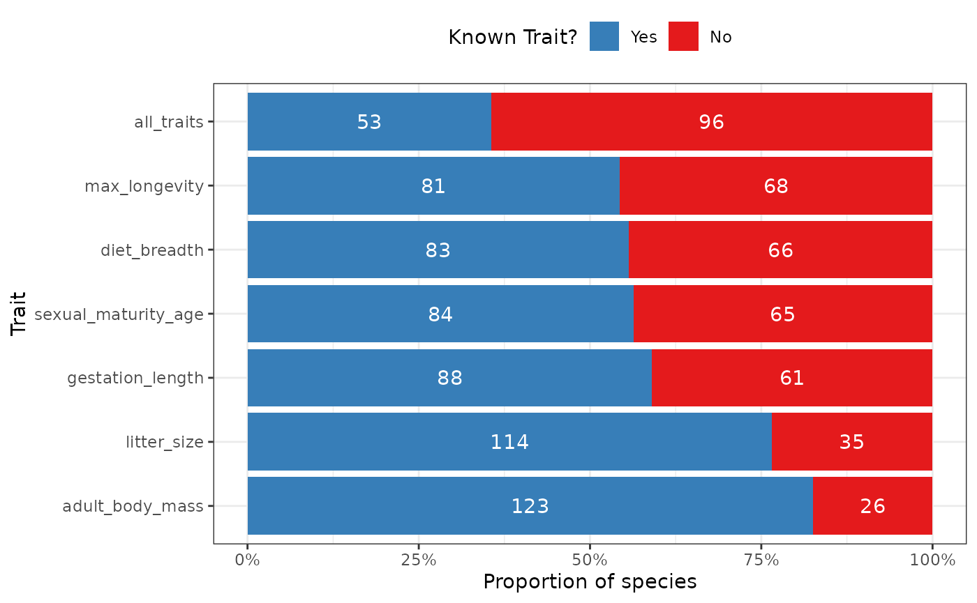
The plot displays the number of species with known and missing traits. It shows each trait in separate lines as a proportional bar chart with the total numbers included within each bar.
Displaying Trait Combinations
Looking at the traits coverage for each species continuously maybe impractical or difficult. For example, when trying to display thousands of species or when the trait coverage varies widely across species. One way to reduce the size of the analyzed (and thus visualized) dataset is, instead, to count at which frequency appear the combinations of present/missing traits.
This is done by fb_plot_trait_combination_frequencies()
which takes two arguments: species_traits, the species by
traits data.frame, and order_by (equals to
either "number", the default option, or
"complete"), which influences the order of the plot (more
details below).
We can use it with the included dataset as an example:
fb_plot_trait_combination_frequencies(woodiv_traits)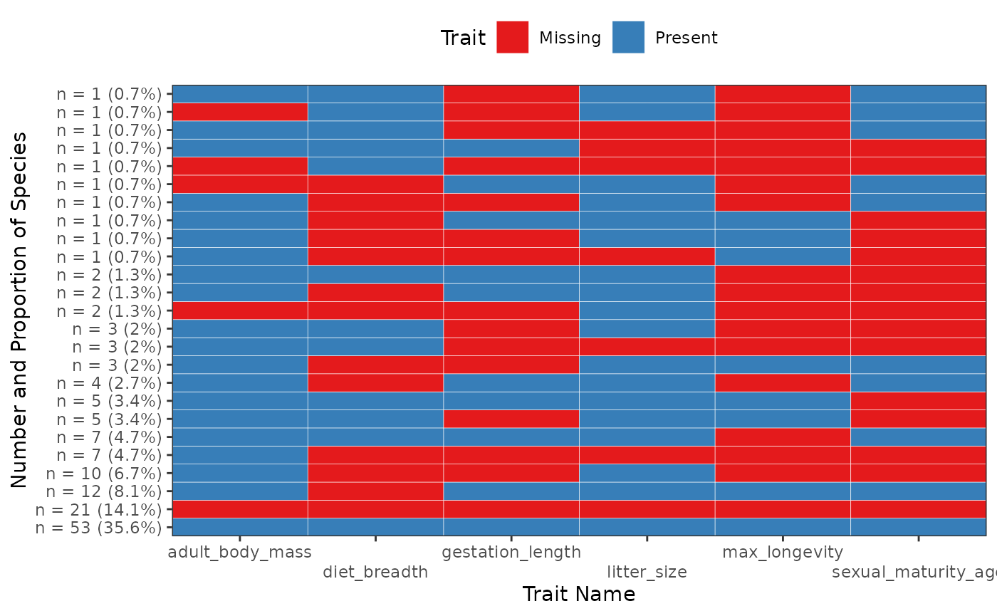
The x-axis represents individual traits ranked in alphabetical order from left to right. The y-axis represents different combinations. The labels on the y-axis show both the number and the frequency of each combination. When the cell is blue, it means that the trait is present; when it is red, it means the trait is missing. By default the combinations are ordered by increasing number from top to bottom, with the most numerous combinations of trait presences at the very bottom of the graph.
With this graph we can see that we have exactly 14 species (58.3% of the total number of species provided) with all their traits that are non-missing, while 1 species has a missing seed mass and a missing wood density.
If we change order_by to "complete", the
combinations are ordered instead by the number of traits presented among
them:
fb_plot_trait_combination_frequencies(woodiv_traits, order_by = "complete")
The most complete combinations are shown at the bottom, while the combinations with most missing traits are at the top.
Displaying Trait Correlations
Most of the plot functions in funbiogeo show traits
independently of one another. However, for functional biogeography
analyses, trait correlations are maybe very relevant. This is exactly
what is done by fb_plot_trait_correlation(). It takes, as
first required argument species_traits, the species by
traits data.frame. The other arguments are optional and
will be passed to stats::cor().
Note that the function only works with numerical
traits and with complete observations. It
silently removes any species that has any NA.
With the included dataset as an example:
fb_plot_trait_correlation(woodiv_traits)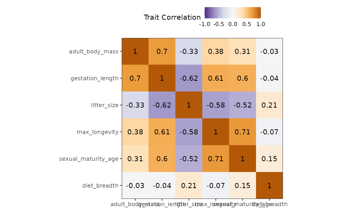
Both x- and y-axes represent the different traits. At their intersection are shown squares that are colored in function of their correlation coefficient (purple means close to -1 correlation, while brown means close to 1 and white means close to 0). The correlation coefficients are also displayed in the middle of this square.
With this visualization we can see that our traits are mostly uncorrelated, there is a slight negative correlation of plant and wood density (cor = -0.2).
Maps
Map functions in funbiogeo are here to provide good
default visualization leveraging the spatial information of sites. We
know that producing maps in R is challenging. That’s why we provide
these helper functions. Of course, these functions are all basic, and
you either have to customize them by adding ggplot2
commands to the returned plots, or to look at their code to produce
similar plots in the way you want.
For example, the functions do not display background maps because it would be too complex to accommodate for all use cases between quite localized sites up to global level analyses.
Note that all maps are always in the Coordinate Reference System of
the provided site_locations object. You can also tweak that
by adding a custom ggplot2::coord_sf() call.
Mapping Trait Coverage of Sites
The function fb_map_site_traits_completeness() maps the
trait coverage (proportion of species, weighted by relative abundance if
relevant, with known trait values) of each site for all traits.
It takes three arguments: site_locations (spatial
locations of sites), site_species (site by species
data.frame), and species_traits (species by
traits data.frame).
If we use the included dataset in funbiogeo it
gives:
fb_map_site_traits_completeness(
  woodiv_locations,
  woodiv_site_species,
  woodiv_traits
)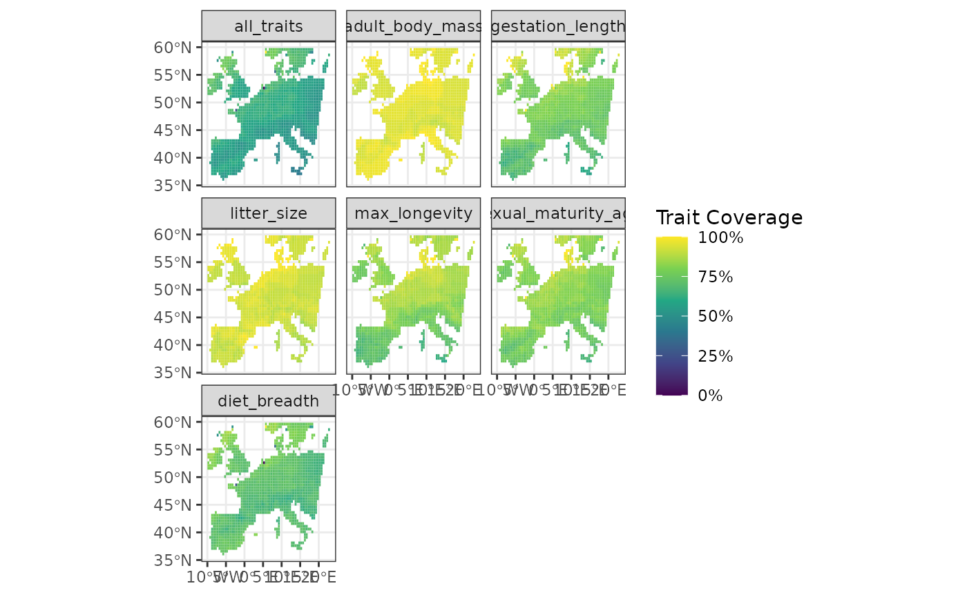
It displays maps of the sites, colored by their trait coverage. Each
facet represents a different trait while the all_traits
facet consider all traits together.
From this plot we can see that on average the center of Spain shows lower average trait coverage. It may be an indication of higher species richness in Spain compares to other places which makes achieving high coverages more difficult.
Mapping Arbitrary Site Data
To be the most flexible possible, funbiogeo provides a
function to map arbitrary site data whether quantitative or qualitative
with the fb_map_site_data() function. The first argument it
takes is site_locations, the spatial locations of sites as
an sf object, the second argument is site_data
which is a data.frame containing a "site"
column and data in additional columns. The third and last required
argument is selected_col which should be the name of the
column provided in the site_data data.frame
that is going to be used as a variable to display. All three arguments
are required.
For example, if we want to get a map of the species richness of the included dataset, we can do the following:
# Compute Species Richness
site_rich <- fb_count_species_by_site(woodiv_site_species)

# Map of Species Richness
fb_map_site_data(woodiv_locations, site_rich, "n_species")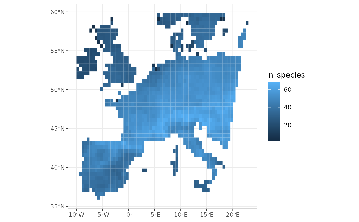
From this map, we can, for example, see that the French part of our dataset is the most species-rich compared to the other places.
Now imagine we want to display the category of sites, which be “Testing” or “Training”, depending on which set they belong to. We can use the following to display the map:
# Generate categories
site_cat <- data.frame(
  site = woodiv_site_species$"site",
  set = sample(
    c("Testing", "Training"),
    nrow(woodiv_site_species),
    replace = TRUE
  )
)

# Display them
fb_map_site_data(woodiv_locations, site_cat, "set")
Mapping Site Rasters
Mapping rasters can be quite cumbersome with R.
funbiogeo provides a generic function to map them with
fb_map_raster(). It only needs as first argument a
terra SpatRaster object. It can be very useful
when visualizing environmental layers, for example. The function will
display the raster in the provided projection.
For example:
# Getting the raster
raw <- system.file("extdata", "annual_mean_temp.tif", package = "funbiogeo")
tavg <- terra::rast(raw)

# Mapping the raster
fb_map_raster(tavg)